The importance of providing a driver with a visual user interface in which controls can be rapidly identified and information content easily read appears self-evident. If text or numeric characters are hard to read, user satisfaction is negatively impacted and the risk of accident may increase due to both increased time of the eyes being directed away from the roadway and from cognitive distraction.
In a recent Monotype-sponsored webinar hosted by Automotive Megatrends, entitled “Balancing the Design and Science of Typography for the Automotive Space”, Postdoctoral Associate Jonathon Dobres of MIT AgeLab discussed various aspects of legibility testing and provided insight into how font choice impacts glance time in automotive interface design.
Since 2012, Monotype and AgeLab have been working together to take a fresh look at glance-based legibility and inform the industry on ways to enhance legibility and potentially reduce interface demands of their human machine interface (HMI) designs.
Dobres has acted as lead on many recent AgeLab research investigations into how the slight change of a typeface in an in-vehicle environment can impact legibility at large. The company has recently joined forces with Monotype Imaging Holdings to develop a new, streamlined methodology for testing the legibility of typefaces on screens under glance-like conditions.
Speaking about the combined study between Monotype and AgeLab, Dobres said, “Our 2012 study, which was conducted in a full driving simulator, showed that something as subtle as the choice of typeface for a menu screen could translate to substantial differences in how the driver interacts with the device. Since then, OEMs have been quite intrigued by the findings and have engaged Monotype’s type design and research experts to help them look at ways to potentially optimise typefaces for their HMI designs.”
The new study correlates with the results of the previous research but uses an adapted Stimulus Onset Asynchrony (SOA) methodology to create a more flexible, cost- and time-effective way for designers to test specific typeface legibility under glance-like behaviour – and help automotive OEMs and HMI designers select a legible typeface for in-vehicle displays.
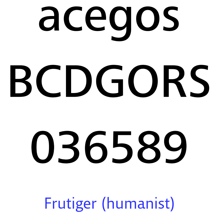
The results of the new tests found that on average, a humanist (Frutiger) typeface could be read accurately in shorter (8.8%) exposure times than a square grotesque (Eurostile) typeface – which was broadly consistent with the legibility benefit for Frutiger as seen in the previous study.
Dobres explained, “AgeLab is interested in bringing objective rigour to the issue of legibility. There has been little research into typeface at the level of design, so AgeLab and Monotype did a study using a driving simulator to gauge which typeface is the most effective, and in our results found that when menus are set in a humanist typeface, people are able to do tasks faster and with less glance time.”
Typeface unmasked
Typeface is something that generally goes un-noticed, something that is not necessarily considered by consumers in their everyday lives. Most people who drive cars wouldn’t necessarily notice a change in typeface, and Dobres explained that when he expresses his research on typeface, he is often greeted by a dumbfounded reaction.
But what if it goes wrong? Dobres underlined the importance of legible styles in a car for a concern that very much affects drivers’ everyday lives: safety.
“When Apple introduced Retina screens two or three years ago, we saw wonderful marketing for a high resolution screen but last year iOS7 saw a radical redesign and every element of the interface, particularly the typeface became narrow. They used Helvetica used for a long time and there were many different weights and variants of it, but for IOS7 they used an ultra light version of Helvetica. Some people came up with the idea that it was a decision hindering legibility, so instead of using ultra light Apple used light. It may not sound or seem like much of a change, but on a Retina screen it makes a huge difference.”
In a car, the use of a legible font is clearly very important, and Dobres suggested that AgeLab and Monotype have looked at typefaces in real world interfaces to deem whether they are appropriate for that particular environment.
The research team also tested the legibility of white-on-black text as compared to black-on-white, and found that under the same lighting conditions, black-on-white text required about 39% less time to read accurately.
Dobres told Automotive World, “Although the two studies utilized very different tools and measurements, they have arrived at similar conclusions, giving the research team confidence in the new streamlined methodology. This is important because the new methodology, although not specific to the automotive HMI, is more efficient and cost effective and has the potential to be used more readily to guide and inform HMI designers on typeface legibility and glance-like performance.”
From a design perspective, Dobres explained that many in-vehicle interfaces really lag behind what has happened in the sphere of mobile phones. This, he said, is “why Apple and Google are pushing so hard with their own automotive solutions. I’m very interested in watching that in the future.”
One size doesn’t fit all
As automotive HMIs are designed and redesigned at a rapid clip, this type of research can be used to inform design decisions.
Automotive World also spoke to David Gould, Director of Product Marketing at Monotype, regarding the requirements of in-vehicle interfaces, and he suggested are often guided by engineering requirements. He said, “Engineering is often a requirement on the one end, which pays little heed to visual design, and “look and feel” mandates on the other, which often do not account for human psychology and behaviour. As a result, even the most skilled interface designer may struggle to balance art with science, making it difficult to develop a beautiful and wonderfully functional interface that does not overload the consumer.”
Of course, there isn’t just one typeface that works perfectly everywhere, and even a legible typeface can come under dispute. The main concern in the automotive industry, highlighted by Dobres, is that one size doesn’t fit all when it comes to typeface, and OEMs often want their branding to extend to their typeface, not always resulting in the most optimal legibility for drivers.
So where is the compromise? Dobres explained that much of the typeface in a car does have to do with the tensions of branding. He said, “Eurostile has a futuristic look so many brands like that but there are other typefaces that have the same theme and cultural notes but may not be as geometric and tightly spaced, resulting in better legibility.”
Balancing scientific best practices and branding is a conversation that Monotype is having with many OEMs and manufactures. Dobres suggested, “It is beneficial to suggest to the OEMs that a certain branch of the typographic tree is probably beneficial to them and that they might want to choose something in that family.”
Dobres also explained the importance of working with regulatory bodies in the future. He said, “The conversations we have had with some regulatory bodies and OEMs have been used to inform some ISO standards. We are also trying pass research onto the National Highway Traffic Safety Administration (NHTSA) to make regulatory bodies aware of the importance of typeface so they can create better informed guidelines.”
Rachel Boagey
Follow this link to find out more about the recent Monotype-sponsored webinar hosted by Automotive Megatrends, entitled “Balancing the Design and Science of Typography for the Automotive Space”